





Paper ends up in a drawer; a PDF gets forgotten in Downloads. A wallet pass sits in the stack people open every day — here's what that changes.
By The ReeCard team · September 6, 2026 · 4 min read

A bio page has one job: get the visitor to the next step. Yet most of them look like a settings menu — twelve buttons, no hierarchy, no reason to tap any of them.
Decide the single action you want this week: book a call, watch the reel, buy the drop. Put it first, give it a clear label, and let everything else support it. On VIP, the featured poster gives that action a wide, tappable image.
Your analytics dashboard shows link taps by platform. If nobody has tapped Facebook in a month, hide it. Fewer options, more taps — every time.
Brand colours, a real photo, and a layout that matches your vibe (Noir for night owls, Aurora for coaches, Spotlight when your face is the product). Consistency between the page and the wallet pass builds trust in two seconds.
Paper ends up in a drawer; a PDF gets forgotten in Downloads. A wallet pass sits in the stack people open every day — here's what that changes.
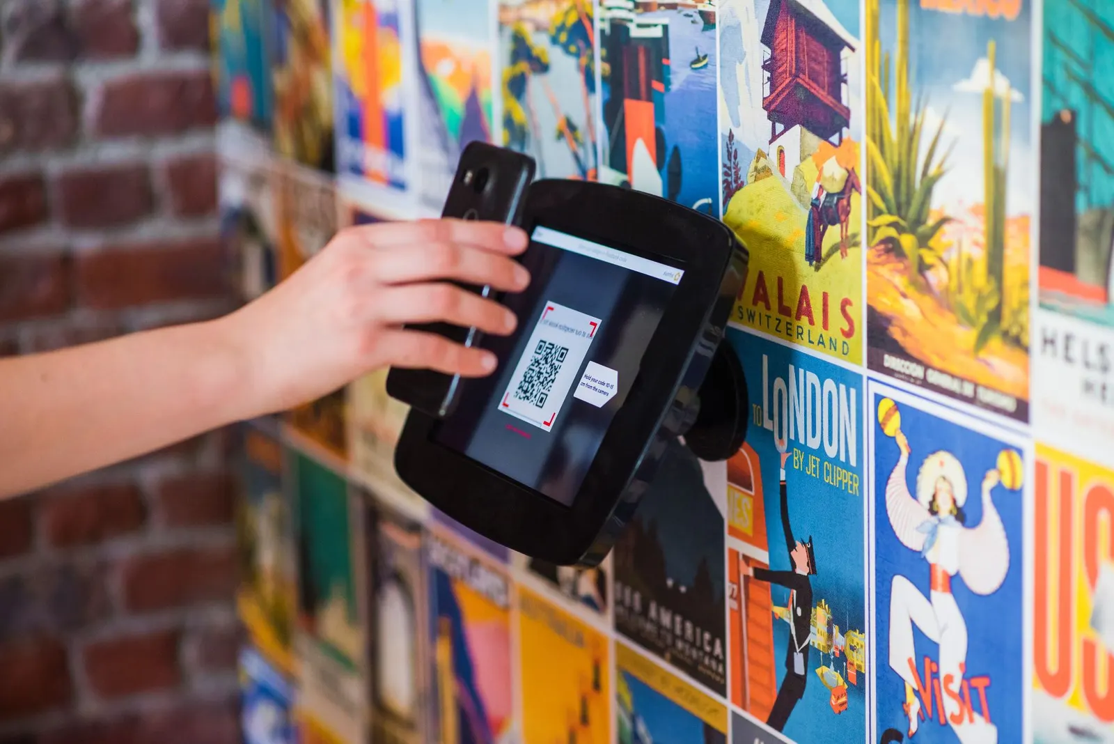
Where to put the code, how big to print it, and how to read the scan data afterwards.